Should ‘Energy Hogs’ Shoulder More of the Utility Cost Burden?

Electricity rates often target high-usage households, "energy hogs", with higher prices. This study shows that benign factors—number of occupants, climate in household location, and ability to install rooftop solar—drive most of the differences.
At a Glance
Key Challenge
Regulators typically associate high electricity use with wastefulness, justifying a greater financial burden on such households. Yet, there is no prior research to support that inference.
Policy Insight
Policymakers should abandon their inclination to judge the appropriateness of a household’s energy consumption and focus on pricing that reflects the cost of providing the energy, including the environmental damage.
Electricity regulators have two primary jobs: figure out how much to pay the regulated utility (i.e., set the revenue requirement) and decide who will pay (i.e., allocate the revenue burden across customers). In deciding how to allocate the burden, regulators typically first divide up the requirement across customer classes: residential, commercial, industrial, agriculture, and occasionally others. Then they must find some basis to allocate within classes that seems equitable across customers and establishes consistent with the regulatory policy goals.
In the residential class, which tends to get the most attention, there are usually two mechanisms for collecting revenue: a fixed monthly charge and a volumetric (per kilowatt-hour) price. Clearly, if more of the revenue is collected through a fixed charge and less through a volumetric price, households who consume more will benefit relative to those who consume little. On the other hand, if a larger share of revenue comes from a volumetric price, large consumers will be worse off.
Regulators face a related policy choice about whether the volumetric price should change as households consume more or less—known as increasing-block or decreasing-block pricing—or whether the price of a kilowatt-hour (kWh) to a household should be independent of how many kWhs they consume.
Debates over how much of the residential revenue burden should be recovered through a fixed charge and whether the per-kWh price should vary with consumption level focus in part on which utility costs are fixed versus which vary with the level of a customer’s consumption. These debates, however, often also wander into judging high-usage customers as wasteful or imprudent “energy hogs.”
This argument has been around for decades. Twenty years ago, it was made in support of increasing-block pricing by the then-president of the California Public Utilities Commission. But there seems to have been little or no analysis to back up this viewpoint. And there are compelling grounds for skepticism. After all, there are many obvious reasons for variations in consumption across households that few people would argue indicate wasteful or imprudent usage, such as more people living in the house.
In 2023, when California began debating the introduction of fixed monthly charges, it came as little surprise that some suggested it was an issue of moral character. One NGO filed testimony claiming, “high fixed charges [result] in the ratepayers with the least efficient consumption patterns realizing the greatest amount of savings (Schwartz 2023).” There were many similar public statements that characterized the winners as “energy hogs.”
I was troubled that this narrative seemed to lack an appreciation of the many ways in which such households differ. So, I dug into some data to figure out how fair these characterizations are. In new research (Borenstein 2024), I present an analysis that sheds some light on how much we can infer from household electricity consumption.
The paper first analyzes the extent to which “benign” factors —such as the number of household occupants—drive household electricity consumption. It then looks at the role of household electricity consumption in economy-wide energy use and climate impact, asking whether it is likely to be the major driver of variation among individuals in their energy or climate footprint.
What Makes a Hog a Hog?
In a way, it’s understandable that those concerned with energy use would zero in on household-level electricity (and, to a lesser extent, natural gas). It’s the one component of consumption that a single entity —the distribution utility— knows (almost) completely, unlike gasoline, air travel, or all the energy embodied in the goods and services we buy. But that precision could still be misleading when used to judge whether one customer is more wasteful or more responsible in their energy consumption.
Piggybacking on earlier work that Meredith Fowlie, Jim Sallee, and I have done on residential rate design, I use data from California’s Residential Appliance Saturation Survey (RASS) to examine the electricity consumption of about 33,500 residential customers of the three large California investor-owned utilities (IOUs), Pacific Gas & Electric, Southern California Edison, and San Diego Gas & Electric.
I start by looking at the “energy hogs” served by each IOU, defined as the 20% of households with the largest net consumption (that is, after netting out rooftop solar generation if the household has solar), because that is what virtually all households are actually billed for. Each one percentile of those households is represented by a dot in the percentile lines in Figure 1. By this definition, the “hog” households are all bunched at the top 20 percentiles of household net consumption, as shown in the top line of figure 1 for PG&E. Figures for SCE and SDG&E, which are presented in the paper, are similar.
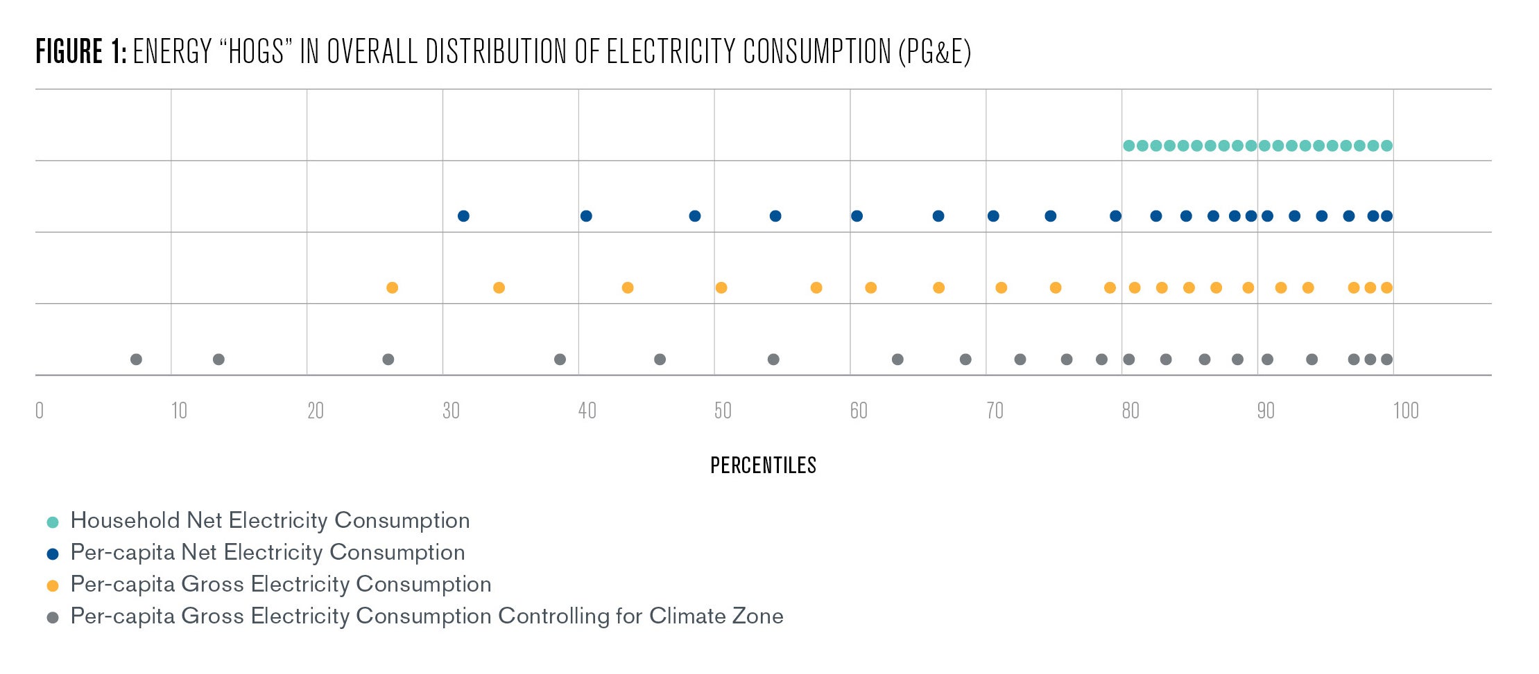
But households have different numbers of occupants, so next I convert the usage of each household to per capita consumption using the information in the RASS and then ask where those households originally characterized as hogs now fall among the distribution of all households. This is the second line for each utility. For PG&E, the lowest 1 percentile of the “hogs” on average is now at the 32nd percentile of all households based on per capita consumption. The second lowest 1 percentile is, on average, at the 41st percentile, and so forth.
Now if we are talking about prudent usage, whether or not a household is also a producer of electricity because they have rooftop solar, isn’t really relevant. Electricity from one customer’s rooftop solar system is part of the grid generation mix, just like electricity another customer buys from a solar farm. So, I next look at where those same households fall when the metric is gross per capita consumption, that is, adding back an estimate of the rooftop solar production their bill netted out. This effectively separates out the production side of so-called “prosumer” households in order to just focus on consumption for this discussion of “hoggy-ness.” With these two adjustments, more than half of the original “hogs” are now outside of the top 20% of consumers, as shown in the third line of Figure 1.
Of course, with air conditioning being a major contributor to electricity consumption, we’d expect that living in the hotter inland California climate would drive up usage even if those households are just as prudent as their halo-wearing brethren on the coast. So, I then examine where these “hogs” lie in the distribution when we also control for the average differential in usage across climate zones.
The result, displayed in the fourth line of Figure 1, shows that the distribution of “hogs” moves even further to the left, and more than one-tenth of them are now all the way down in the “angels” category, with consumption in the bottom 20%. In fact, the distribution of households originally characterized as “hogs” doesn’t look that different from the distribution of consumption among all households.
In some further analysis, I also control for demographics—children and seniors in the house, whether the home is only used seasonally, and whether an occupant works from home—and appliance fuel choices, such as electric heat, hot water, stove, and vehicle, and the age of the house. These all drive consumption but have a relatively small impact on where the so-called hogs lie in the distribution.
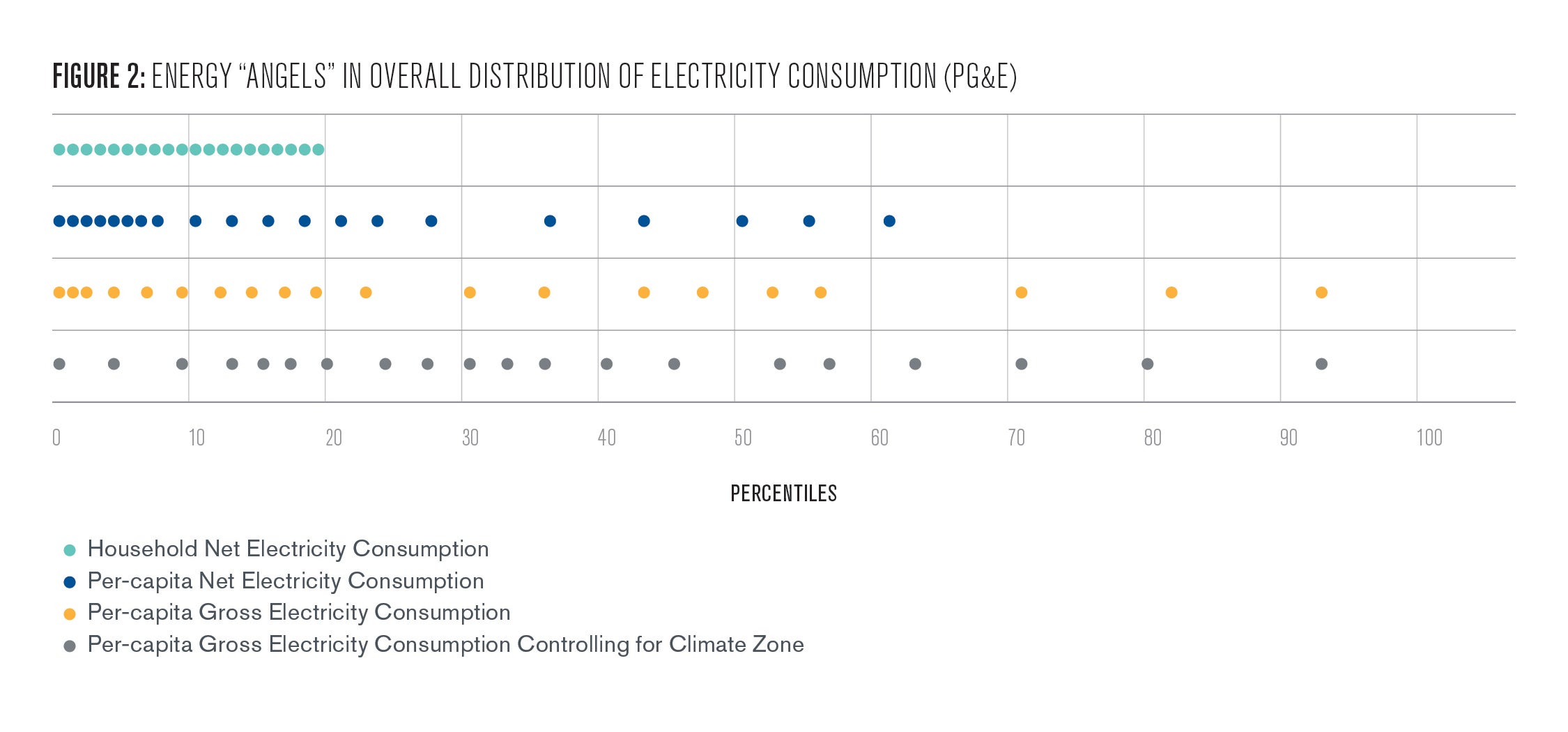
The takeaway from this analysis is that the usage of the top 20% isn’t actually that different from other households after adjusting for three factors that few people would argue constitute hoggy-ness. The parallel analysis of “energy angels,” those in the bottom 20% of net household consumption, shown in Figure 2, indicates that they also look much more like the rest of the population after these adjustments.
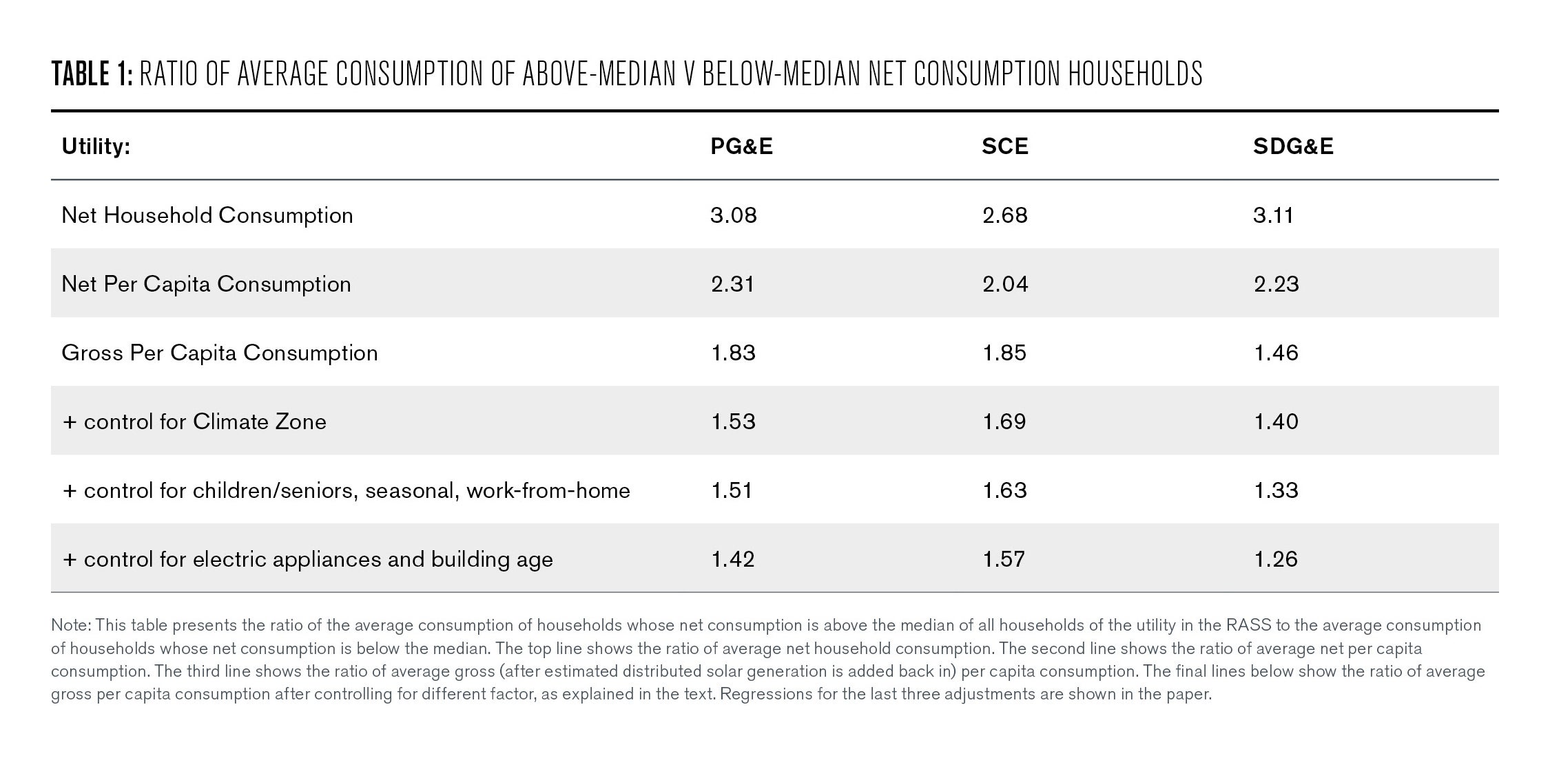
How much like? For a simple numerical measure, I look at the ratio of higher to lower users before and after these three adjustments, as shown in Table 1 for all three utilities. The average net household consumption of those PG&E households above the median is 209% higher than the average of those below the median. But after these three corrections, it is only 54% higher. In other words, about three-quarters of the difference between the heavier-use half of households and the lighter-use half is due to the higher users having more household occupants, fewer solar panels, and living in a hotter climate. An even larger share of the difference between energy “hogs” (top 20%) and “angels” (bottom 20%) disappears when one adjusts for these three factors, as shown in the paper.
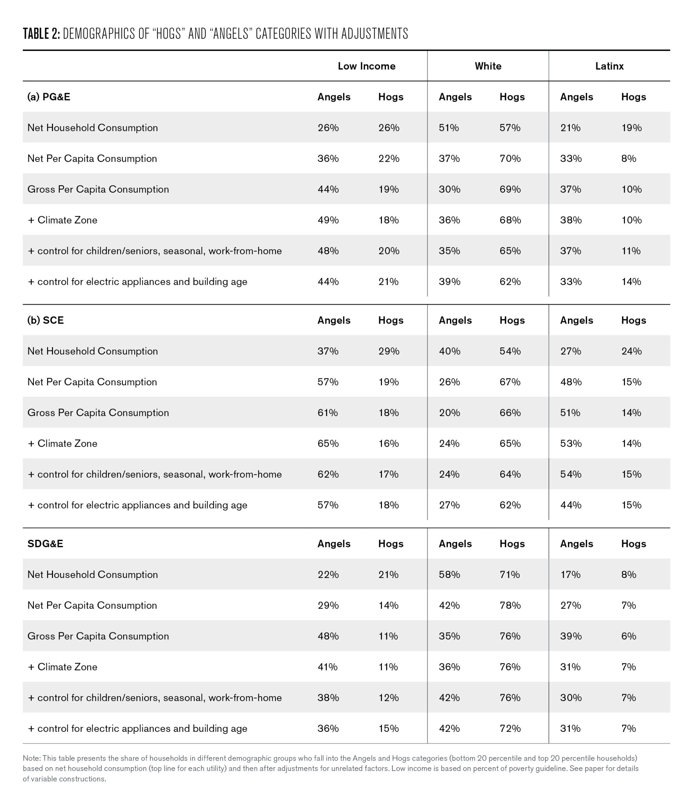
I next ask how these adjustments affect the demographics of households labeled energy hogs and angels. As shown in Table 2, and perhaps not surprisingly, the narrative of imprudent energy hogs and socially responsible energy angels over-represent wealthy and white households among the angels and underrepresents them among the hogs when we fail to adjust for differences in number of occupants, rooftop solar, and climate. At the same time, it greatly under-represents Latinx families among the energy angels. The narrative of energy hogs and angels based on customer electricity consumption not only unfairly characterizes some households relative to others, but it also does so in a way that reinforces socio-economic biases.
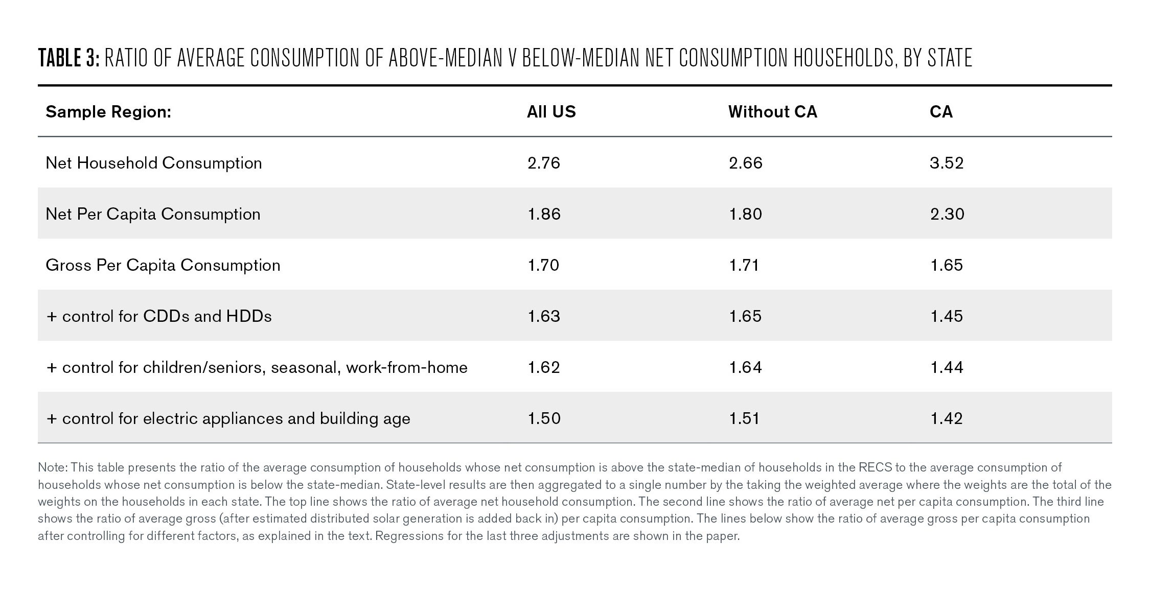
One might wonder if this narrative and this misunderstanding of the causes of variation in household consumption is unique to California. A quick internet search suggests the judgment of large household users is common outside the Golden State. Unfortunately, a dataset comparable to the large RASS survey does not seem to exist elsewhere. But the national Residential Energy Consumption Survey (RECS) offers a smaller dataset—with observation counts by state ranging from 143 in Delaware to 1152 in California— that includes many of the same variables. Table 3 presents a parallel analysis for this national sample—with the analysis done at the state level and the results then aggregated up to national. It shows that the results are generally very similar, though the impact of solar is much smaller outside of California, which is no surprise given that nearly half of rooftop solar is in the state.
When it comes to electricity rate design, regulators need to think through many difficult factual and policy questions. Facile judgments of responsible “energy angels” and imprudent “energy hogs” seem to do more to cloud than to clarify these important issues.
Energy Hogs Roaming Across the Economy
Though it’s understandable that a policymaker concerned about imprudent energy use might focus on home consumption because that’s where the data are, it begs the question of how much one can infer about energy consumption prudence from observing just the level of residential usage. That’s a difficult question to answer, but a useful first step is to ask what share of usage is residential electricity.
Figure 3 is the 2022 EIA U.S. energy flows graphic. To infer the share of U.S. primary energy use that goes into electricity—which includes the losses in electricity generation and transport —I multiply the share of energy that goes into electricity generation (37.8 quads divided by 100.4 quads) by the share of electricity that is used by households (39%), which implies a 15% share of total energy is attributable to residential electricity consumption. Adding in residential natural gas raises it to 20%.
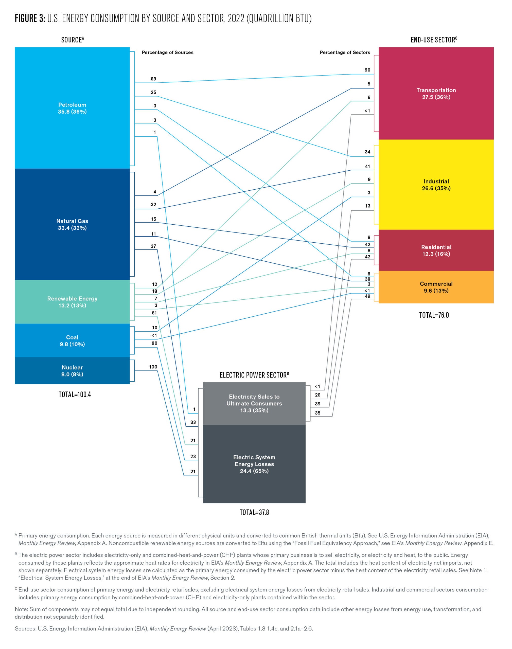
Virtually all U.S. energy use eventually benefits some U.S. households (after a small adjustment for the net impact of imports and exports), yet nearly all the moral judgment—and use of the term “energy hog”—is reserved for energy consumption in the home. There is discussion and policy about how to make the 80% used outside the home more efficient, but you don’t see the sort of shaming or financial penalties that we see for residential usage, and that in many parts of the country is official policy.
Prices for gasoline, air travel, energy-intensive production goods, housing, food, and all of the other goods and services that constitute the 80% are set by market forces. The prudence of households that consume low or high quantities plays essentially no role in the price they pay. In fact, many such goods are sold with quantity discounts or with additional rewards to customers who consume high quantities, such as through customer loyalty programs employed by airlines, supermarkets, and other industries.
Residential energy consumption seems to sit alone as an area of consumption for which some believe payment should be based on the ethics of high usage levels. As a result, households whose consumption preferences or realities tilt more toward staying at home take a disproportionate hit relative to those who choose to spend a higher share of their income on travel, dining out, and consuming other goods and services. It is hard to come up with an equity-grounded argument for such asymmetric treatment. It is almost certain, however, that this emphasis hurts lower-income households because, on average, they spend a far higher share of their income on residential energy.
Is Energy Even the Concern?
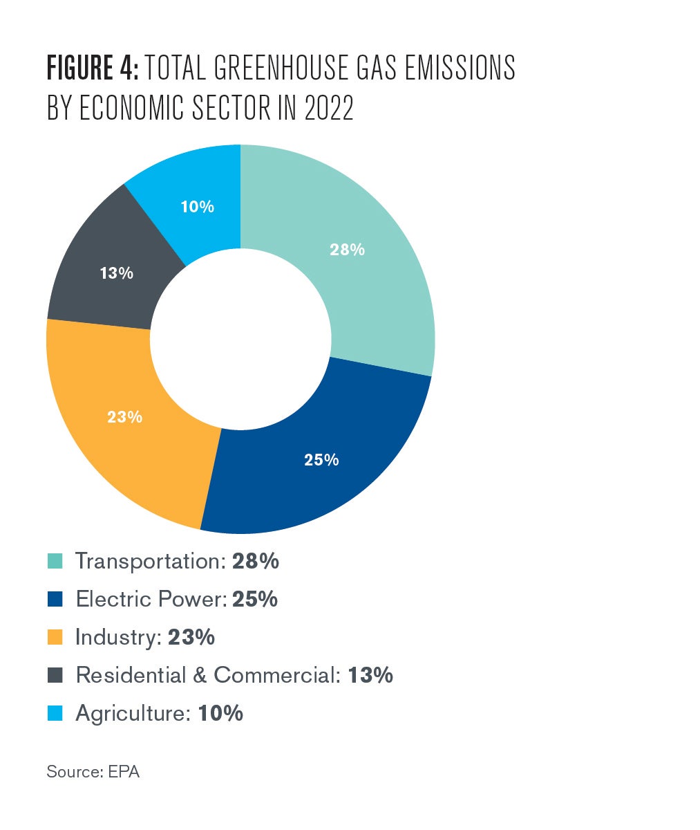
But energy isn’t ultimately the concern of most policymakers anyway. For most, it is environmental impact. Through that lens, singling out home electricity usage is especially problematic. If we apply the residential share of electricity to the EPA’s emissions accounting (Figure 4), electricity use in the home accounts for only 10% of U.S. GHG emissions.
It likely accounts for an even smaller share of the damages from local pollutants because coal is in decline as a fuel for electricity, and power plants generally are located farther from where people live than are the diesel trucks on freeways and industrial facilities. Not to mention the indoor air quality issues created by combusting wood or natural gas at home. If we really care about GHGs and local pollution emissions, focusing on residential electricity consumption is particularly misplaced.
Hogs, Angels, and Air Travel
While writing the paper and thinking about energy and emissions in the broader economy, I got to thinking about how other common activities stack up against electricity usage for climate impact. Perhaps because I have done quite a bit of research on the airline industry, a comparison to air travel seemed natural. Here’s a calculation that I think yields valuable context:
I showed in the first part of the paper that, after controlling for the number of household occupants and the local climate and counting total electricity consumption regardless of whether the juice is from the roof or the grid, the usage difference is greatly reduced between households that appear to be “energy hogs” and those that appear to be more energy-efficient “angels.” In fact, adjusting for household occupants, climate, and gross consumption, the difference between the 25th and 75th percentile consumption per capita among the customers of California IOUs is 2058 kilowatt-hours per year. The difference between the 10th and 90th percentile is 4372 kWh/year.
The marginal emissions rate from electricity generation in California—the change in emissions from a one MWh change in output—is approximately 0.4 metric tons per MWh. So, given their difference in usage, a 75th-percentile household is responsible for about 0.82 more metric tons of GHG emissions per year than a household at the 25th percentile. The difference between the 10th and 90th percentiles is about 1.75 tons.
For comparison, the U.S. domestic airline industry gets about 62.6 passenger miles per gallon (details in the paper) and each of those gallons puts out about 0.01 metric tons of GHGs. That means one person’s 5,400-mile round-trip between San Francisco and Boston burns about 86 gallons and releases about 0.86 tons of GHGs. In other words, a single coast-to-coast round-trip flight cancels out the annual GHG difference between a person living in an “efficient” 25th percentile electricity use home and a person living in a “pretty hoggy” 75th percentile electricity use home. Taking two roundtrips in a year nearly wipes out the emissions difference between an “energy angel” in the 10th percentile and a “hog” in the 90th percentile. That certainly wasn’t something I knew before, and I suspect it is not something known by other halo wearers who buy high-efficiency appliances, install triple-pane windows, set their air conditioning to 77 degrees, drive EVs, and generally walk the walk…that is, until we fly the flight, to another conference or well-deserved holiday.
Conclusion
I don’t think this research suggests that we should stop flying entirely or stop producing and transporting goods that we buy in stores or have delivered to our homes. It does suggest that it is easy to judge people by one kind of behavior and ignore all the other things people do that contribute to pollution and the climate crisis. It is human nature to focus on the metrics by which we appear most socially responsible and downplay the ones that aren’t as flattering.
Unfortunately, some advocates and policymakers seem to think this natural bias should drive policy when it comes to electricity rate design. What I take away from this research is that residential electricity use is a small, though still important, component of our climate crisis and pollution problems. There is clear evidence, however, that it is not a good guide to determining which households are consuming energy imprudently or imposing more damage on the planet and its occupants.

Severin Borenstein
E.T. Grether Professor, Haas School of BusinessSeverin Borenstein is E.T. Grether Professor of Business Administration and Public Policy at the Haas School of Business and faculty director of the Energy Institute at Haas. Borenstein is a 2023-2024 Kleinman Center Visiting Scholar.
Borenstein, Severin. 2024. “Energy Hogs and Energy Angels:
What Does Residential Electricity Usage Really Tell Us About Profligate Consumption?” Energy Institute at Haas Working Paper WP 341R. https://haas.berkeley.edu/wp-content/uploads/WP341.pdf
Schwartz, Ben. 2023. “Rebuttal Testimony of Ben Schwarz on Behalf the Clean Coalition.” https://docs.cpuc.ca.gov/PublishedDocs/SupDoc/R2207005/6144/510460494.pdf